Background Debbi wanted her website redesigned to be more family-based or community oriented. Her home page was oversaturated with content and blog articles. There was even a sidebar that was simply overwhelming. Also, the theme-based site lacked any sort of consistency. There were also a lot of issues with her site in general; database errors, etc. Many more people left her site than became engaged and it affected her click-through rate. There was no clear call to action anywhere on the site. So, it was time for a website refresh.
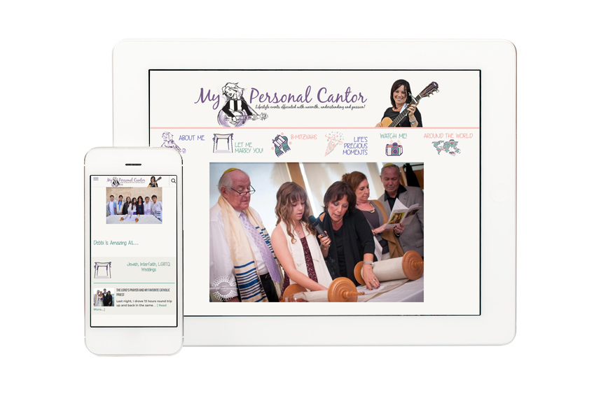
Brand Solution A solution was to make the site more readable, so viewers could be easily engaged and interact with the content and events. Her idea of a perfect product was to make the site more personable with the use of handdrawn / illustrative graphics. The biggest challenge was to make her site appear more organic and not so grid-like, much like the way a lot of themes appear today. We selected a handwritten font to make the site seem more playful, soft, and colorful; similar to a wedding photographer’s website. All of the graphics were built completely from scratch along with the layout and site structure. The site navigation was a bit of a mess, so we really spent a lot of time cutting down and combing through the pages to combine content. Each navigation link had its own specific graphic, so we really had to spend a lot of time on the navigation alone.
Features and Benefits There’s a simple Twitter feed as well as a single testimonial and a calendar of events. Before the update, this area was easily ignored at the bottom of the sidebar. In the first round of wireframes or mockups, there was a really nice wheel on the homepage that had the images scrolling side-to-side. Debbi just wanted a simple slider of images that faded in and out. My only complaint was the images provided were not large enough in size to stretch across the page, making it look like an unfinished product with too much white space.
Each interior page was better organized into a cohesive layout which grabs the viewer’s attention and delivers news of each event. The client expressed liking our previous portfolio work for other client sites. Another influence is that Debbi liked my Jewish heritage, so I incorporated my background or upbringing into the final product, as well.
User-Friendly There needed to be an easily updateable area on the home page, a place where Debbi could post news and holiday traditions. The client had to be able to manage this area on her own, so it was paramount that we chose a solution that was user-friendly. The execution of the footer is my all-time favorite because of the custom graphics.
Results After the site was launched, I followed up with some questions about her site performance. It was still premature at this point in time, too early to see any true results. Debbi expressed her satisfaction at how easy it is to publish new content at her own leisure. One specific goal was to reach her viewers all across the world instead of just locally. We encouraged her to post more content and imagery on a regular basis, sharing every event detail to create a better customer experience. In addition, she expressed how much easier it is to post upcoming events using the event calendar plugin directly on her site. Finally, it is essential that the ever-changing news area on the home page is edited on a regular basis.

