Background
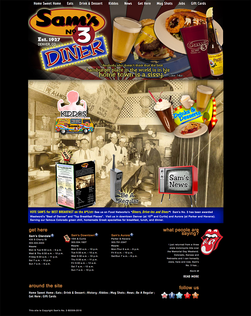
When we looked at how we can redesign the website, the first thing was the look and artwork. We hired a photographer, Chris with Free Lunch Photography, to take some shots of the food. Once we received all of the right artwork, the website started to come to life! This was really a turning point for Sam’s as they did not have any pictures of their food items on the previous website.
Solution
So at that point, we had the artwork, but the biggest challenge was coming up with a cohesive design that would blow the audience away. The graphics had to be playful, but wacky. And we literally started with nothing….no images, no graphics, just the pictures of the food, so the first couple of layouts didn’t give the feel they were after. It was important that the design did not follow a grid or be really boxy like a lot of websites today. After layer upon layer each area of the website became it’s own entity, and we especially depicted that on the homepage by having each unique area point to the pages that were also in the navigation. It created a scene of a noisy, but fun diner. We launched just in time as they were to air on the The Food Network on the show “Diners, Drive-ins and Dives.”
Challenges / Results Six rounds of mock ups later, we launched! Post launch, the client was very satisfied with the outcome. One year later they opened a third location.
[tw-divider][/tw-divider]
The best part is Sam loved the website as much as I loved it.
If you like it as well, I’ll create an amazing website for you.
[tw-button size=”large” background=”” color=”” target=”_self” link=”/free-website-analysis-consultation”]A Free Consultation[/tw-button]
